


I know I have put a strange title, but float is actually a bit weird and in this post, we'll explore some of these weird behaviors and will also look on some methods to fix them.
So for starters, float is basically a positioning property, which is used to wrap text.
Here is how an img tag followed by few p tags will look like:

See that blank space at right of img ? Wouldn't it be better if the text just wrap around that image to fill up the extra space ? Well...that's where float is used.
.img{
float: left;
}
And Voila!

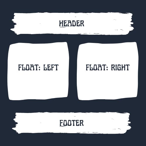
And with just this you can structure your entire web page just by floating containers in different directions.
Nowadays people use flex or grid for the layout. But if float was all soo good, then why not use it for layout also, why people always warn to use float only for wrapping text and not for positioning ?
To understand that let's dive deeper!
The Weirdness Begins
<div>
<img alt="A Big Elephant of 500px x 500px">
</div>
img{
  float: left;
}
 Can you guess, if I inspect the
 div element, what will be it's height ? It's width will take the full screen as div is a block element. But what about height ?
You expect it to be around 500px, right ?
Enough of Suspense! Here's what you'll see if you inspect this.
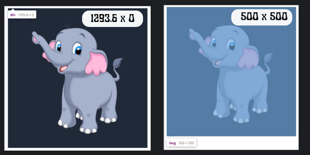 Wait..What!
If
Wait..What!
If img height is 500px and img is a child of div then shouldn't the height of div had to be atleast 500px.
Well that's how float works, you see they just somehow binds with the container. If you change position of div, maybe move it left, then img will also move along with. So it's not like img is not a part of div, it is, but it just anchored with the div and not bounded by the borders of parent element, in this case div.
From our discussion soo far, we can conclude that:
Floated element inside a container does not contribute to the height of container and they are not bounded by the borders of container.
Now because of this anomality some CSS properties doesn't acts like the way you would expect.
And now we are going to see one such property.
overflow: hidden;overflow: hidden, and the overflow amount will get clipped.
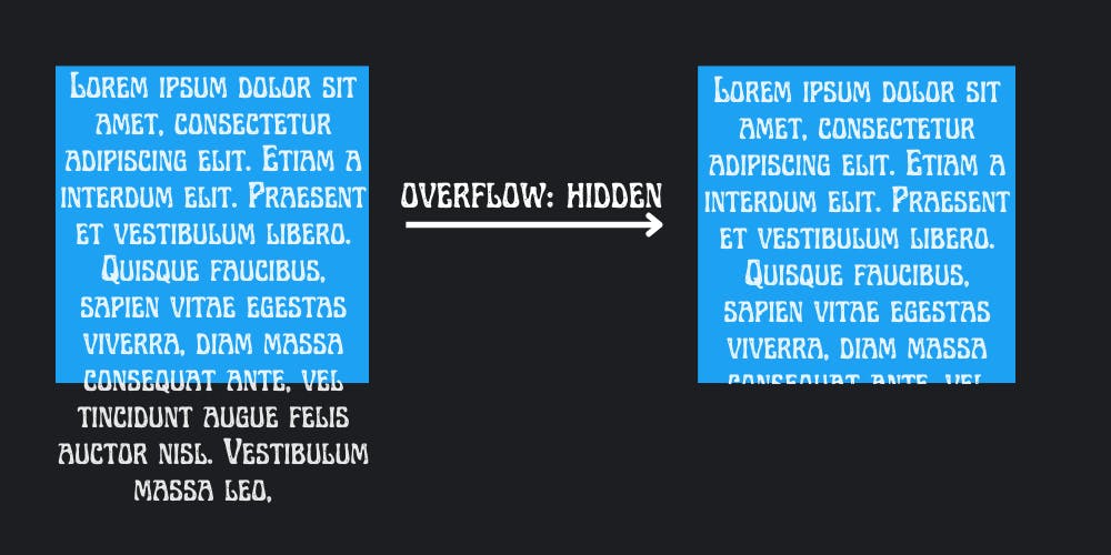 But try doing that with a floated element, what do you think, will it get clipped like above ?
Let's look back to our elephant example.
<div>
<img alt="A Big Elephant of 500px x 500px">
</div>
img{
  float: left;
}
Now, as we saw previously that height of div is 0. So what do you think will happen with this div if you apply overflow: hidden; ?
Can't say about you, but I expect that as the height is 0 that means the entire img is overflowing, so the whole img should be clipped.
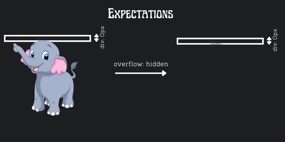 But you know what, the reality is not that simple!
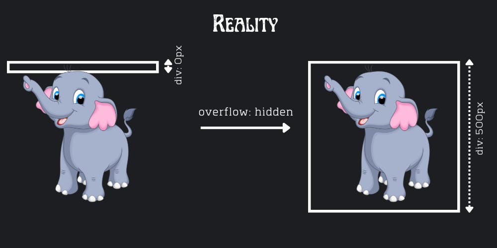 As counter-intuitive it might seems, that's what happens with floated elements. Clipping the excess is a far off thing,
 div itself expanded to contain the img, a floating element.
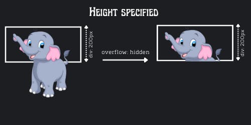
Note: If the height was specified, say
height: 200px, then theoverflow: hidden;will work as expected, even with floated elements.
Methods for Covering up Float
So till now, we saw that floated elements doesn't contribute in height of it's parent element. But, there could be instances when we want our borders to cover up the floated element as well, so that we don't have to worry about the problems that may arise because of this special behavior of float.
Let's see some methods to cover up floated elements.
1. Empty div Method
As we know a div is a block element and takes the entire width available. But even then, if it is placed after a floating element, it will wrap around it.
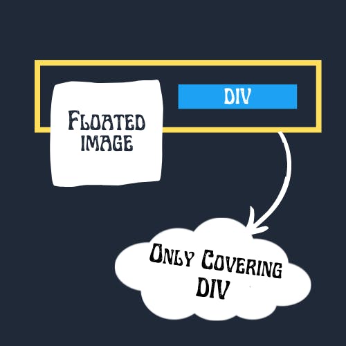 In the above image, the borders are only extending to cover
 div, what we can do to cover img also.
Here is the Hack!
As we know that container(which is also a div here) will extend it's borders to cover this new div inside it, if somehow we can push this div below img, we can trick our container to cover up img in the process of covering for div.
We can achieve this by using clear property. What clear do is, it clears everything to push the element in the side which is specified. For example, clear: left; will clear the left part, so that out element can occupy the left most corner.
In our case we just need to clear: left;, as our image is floating in left only. But still as a general practice, we will use clear: both.
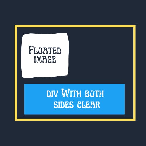 See we achieved what we wanted. And this
 div need not to contain anything. And not only div you can use any container element, but using div is better as it doesn't convey any special meaning to the browser.
2. The Overflow Method
We have already seen this method. It's like we intended it to use for some other purpose, but we found an entire new use case. I'm really not sure why that works, but it works. Just add overflow: hidden; in styling and we are done. But beware while using this, as it is not meant to be used like this.
3. Using Pseudo Selectors (Clearfix Method)
While the overflow method was easiest but as I said it may have repercussion, and for that we have another very intelligent method. In this we won't be doing anything with element, rather we will add a pseudo element and do it's styling to serve our purpose.
To implement this we will add a new class in our container, and name it clearfix.
Then apply the following CSS to make it work:
.clearfix:after {
   content: ".";
   visibility: hidden;
   display: block;
   height: 0;
   clear: both;
}
So these were the methods. Let me know if I missed on something.
 And that was all in this post, this was My First Post EVER! I hope I was able to deliver something valuable to you. Please let me know, if you really found this valuable. Here's my Twitter. You can find links to my other Social Handles by clicking on my profile attached somewhere below, I'll be waiting for your responses.